The artist Angelina Pavanelli contacted me to create cover art and video graphics for her upcoming single "Klick klick köp dig hel." It’s a pop tune that critiques consumer society, with a comedic undertone. "Imagine TV-shop in it's golden age" was what Angelina said to me, and what I began to build the concept around. These are the four key words I took from Angelina:
1. Indie
2. Consumption
3. Retro
4. A touch of "Plastic
Conpect 1 - Data indie
Your typical indie vibe with a nod to Windows 95 incorporated. Here, I was inspired by typical album covers from the indie world with long exposure times and abstract motifs. But with a flirtation to the retro world through pixelated cursors and a frenzied feeling of really bad spam ads.
Concept 2 - Klipp Klipp
Imagine that old girls magazine with tips on how to get that perfect trendy style. A feeling of old magazine ads, and an image of being able to click and piece together your ideal life, all in the pursuit of happiness.
Concept 3 - Retro Special!
This concept became a slightly crazy mashup between 1980s neon, 1940s advertising, and a 2020s artist. Retro, plastic, and consumer frenzy at its finest.
Order now! Only 99.90!
We went ahead with Concept 1, and after requests for "even more plastic" I turned up the consumption dial and filled the wall with poster ads reflecting the song's lyrics. The outfit was recolored to match Angelina's iconic look in the music video.
Watch the video below!
Final design


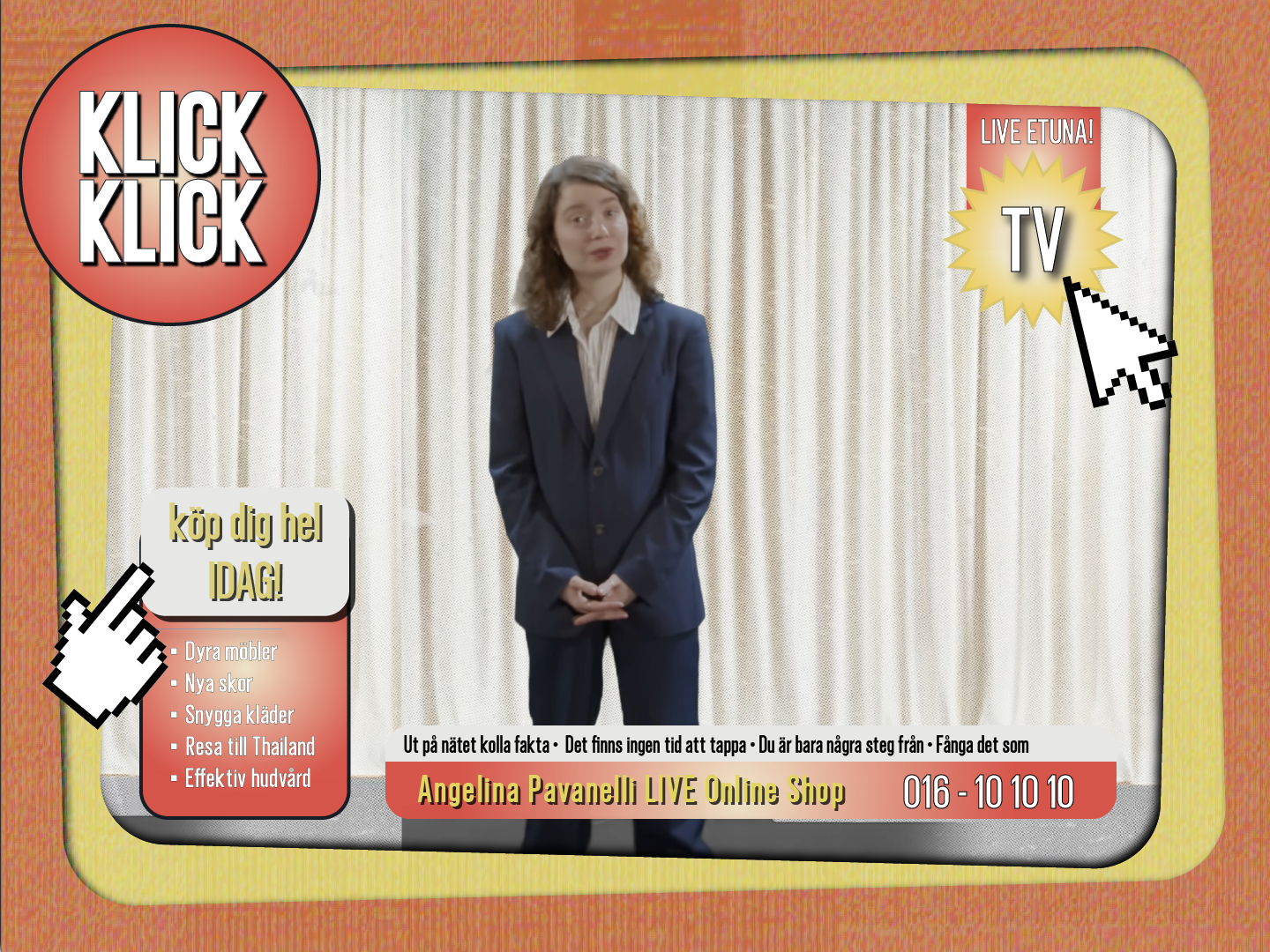
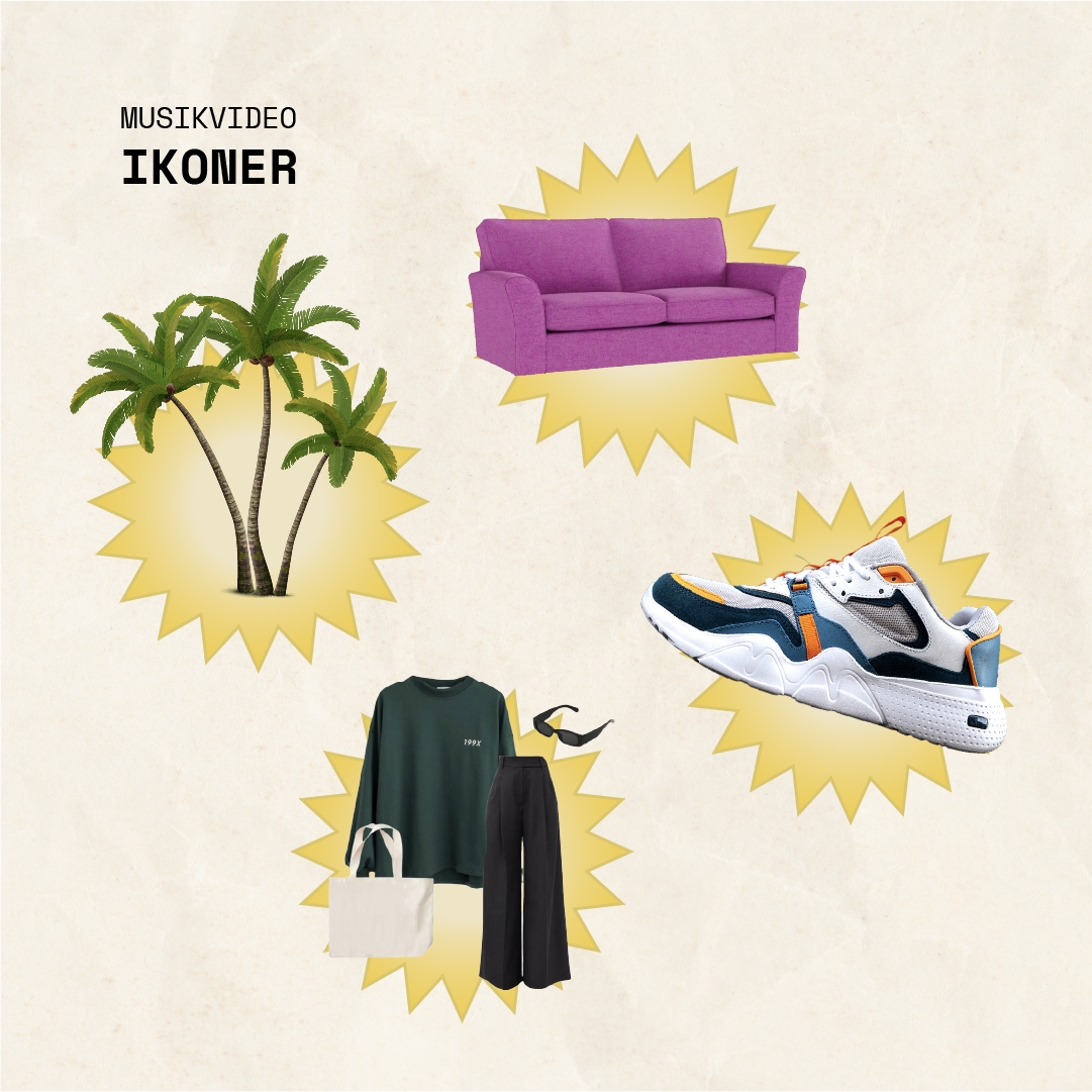
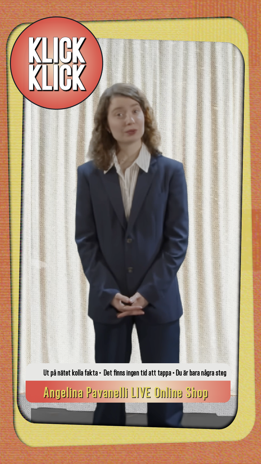
Last but certainly not least, I created the graphics with accompanying animations in the music video. If I had turned the consumption dial up a bit before, now it was cranked up to 11! TV shopping, buying frenzy, and retro in all their glory, also a fun bonus to work in 4:3 format. I also made a 9:16 variant for easy use on social media.

